Profiler Tab
The Data Observability tab is displayed only for Tables. It has three sub-tabs for Table Profile, Column Profile, and Data Quality.Table Profile Tab
The table profile helps to monitor and understand the table structure. It displays the number of rows and columns in the table. You can view these details over a timeframe to understand how the table has been evolving. It displays the profile sample either as an absolute number or as a percentage of data. You also get details on the size of the data as well as when the table was created.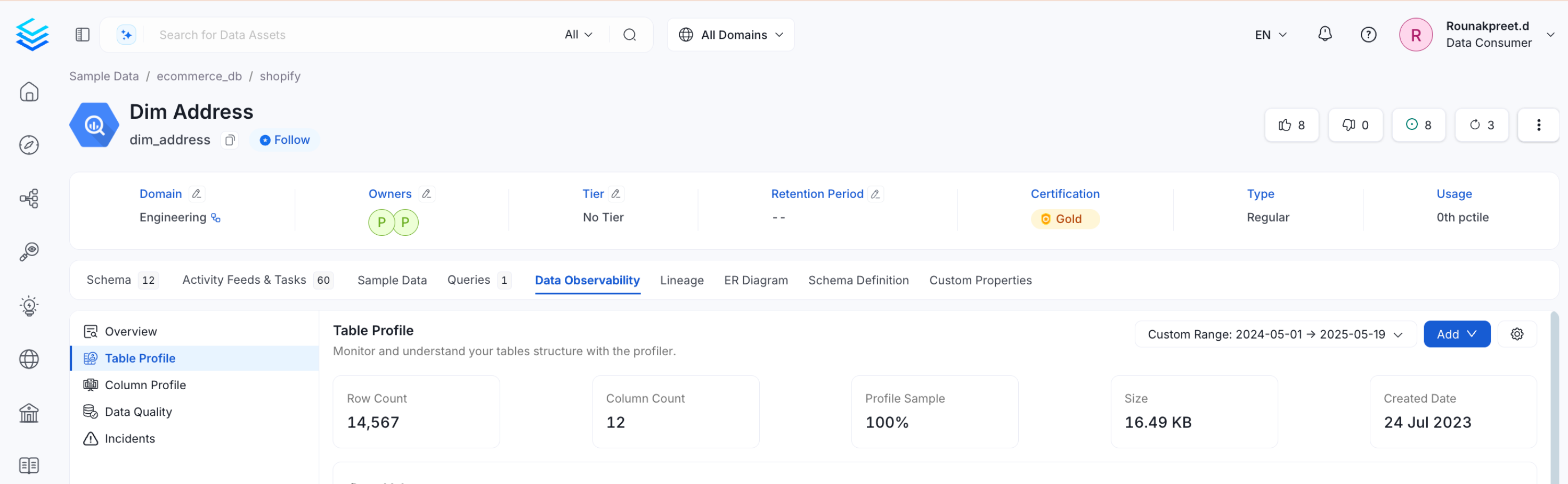
Data Volume
The Data Volume chart gives an overview on how the data is evolving across a time period.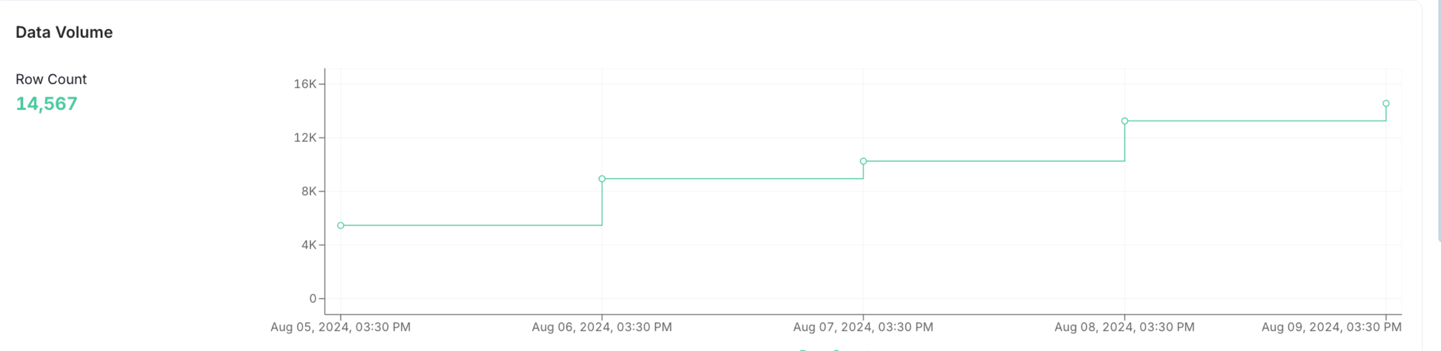
Table Updates
In Table Updates chart, users can view the changes that happened in the table in terms of data inserts, updates, and deletes.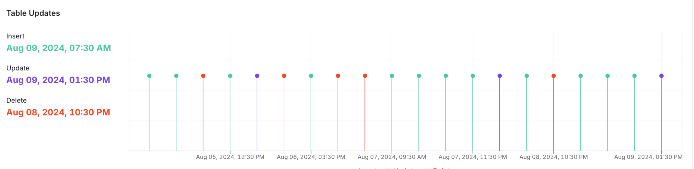
Volume Change
In Volume Change chart, users can view the changes that happened in the table in terms of data volume for inserts, updates, and deletes.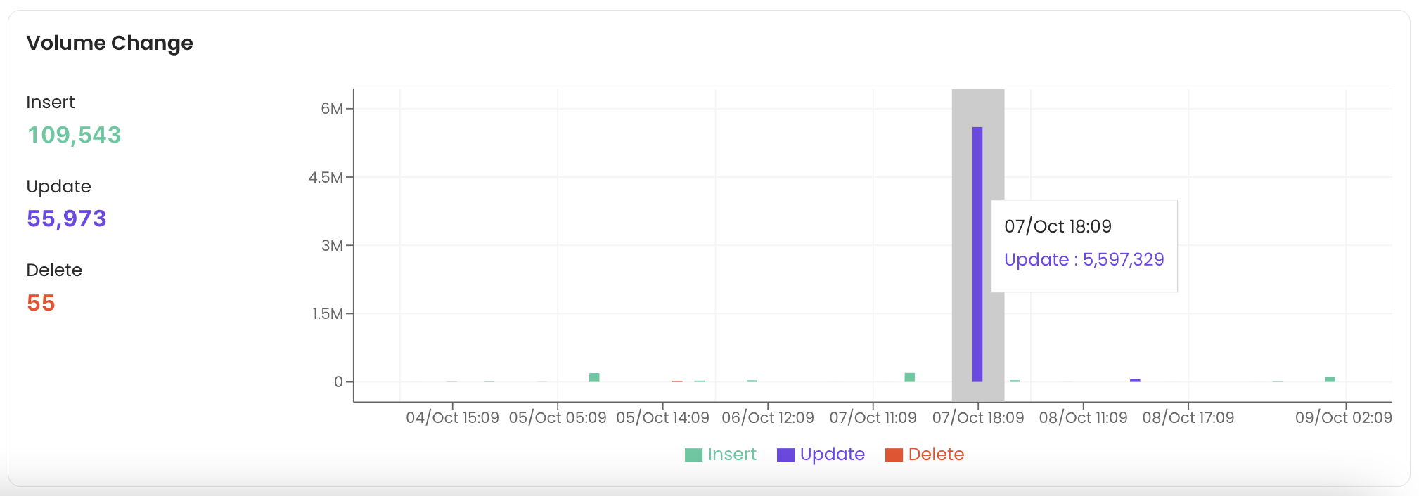
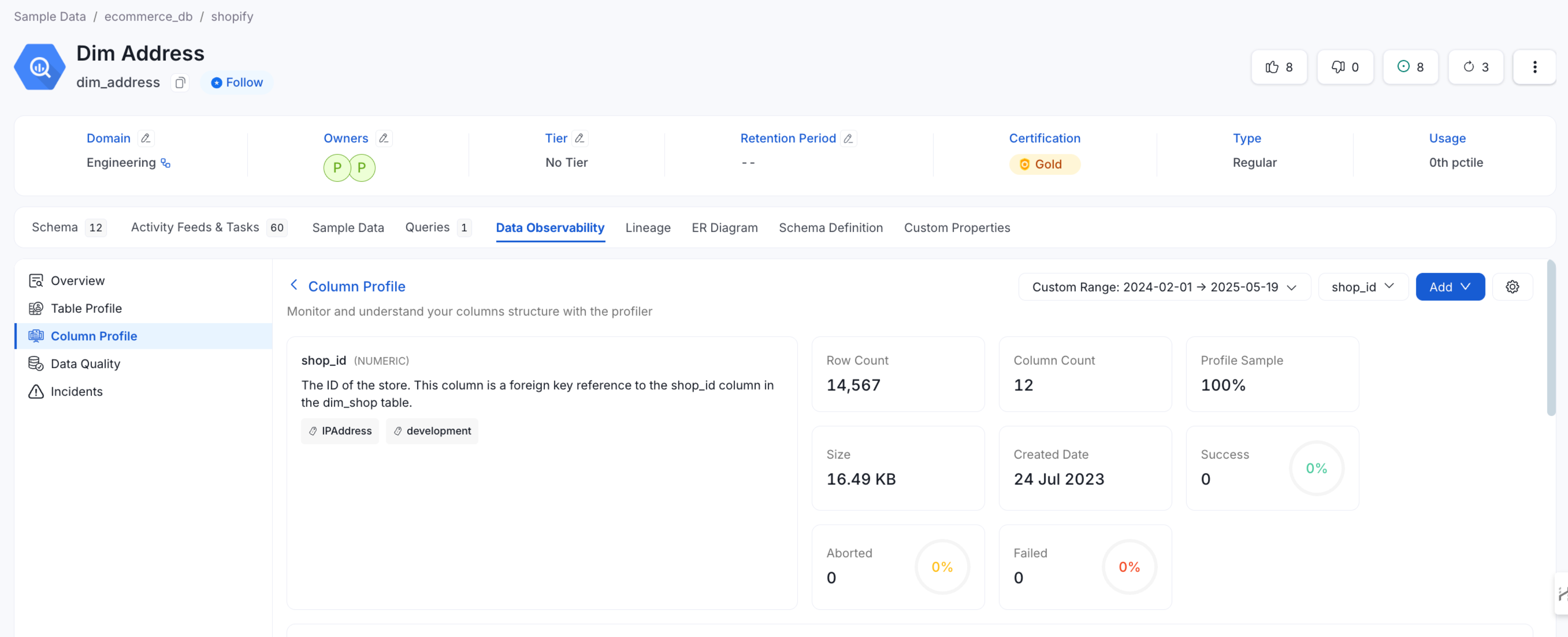
Column Profile Tab
The Column Profile tab provides a summary of table metrics similar to the Table Profile tab. It displays the number of rows and columns over a period of time. It displays the profile sample either as an absolute number or as a percentage of data. You also get details on the size of the data as well as when the table was created. The column profile helps to monitor and understand the column structure with a summary of metrics for every column. You can view the type of each column, the value count, null value %, distinct value %, unique %, the tests run as well as the test status.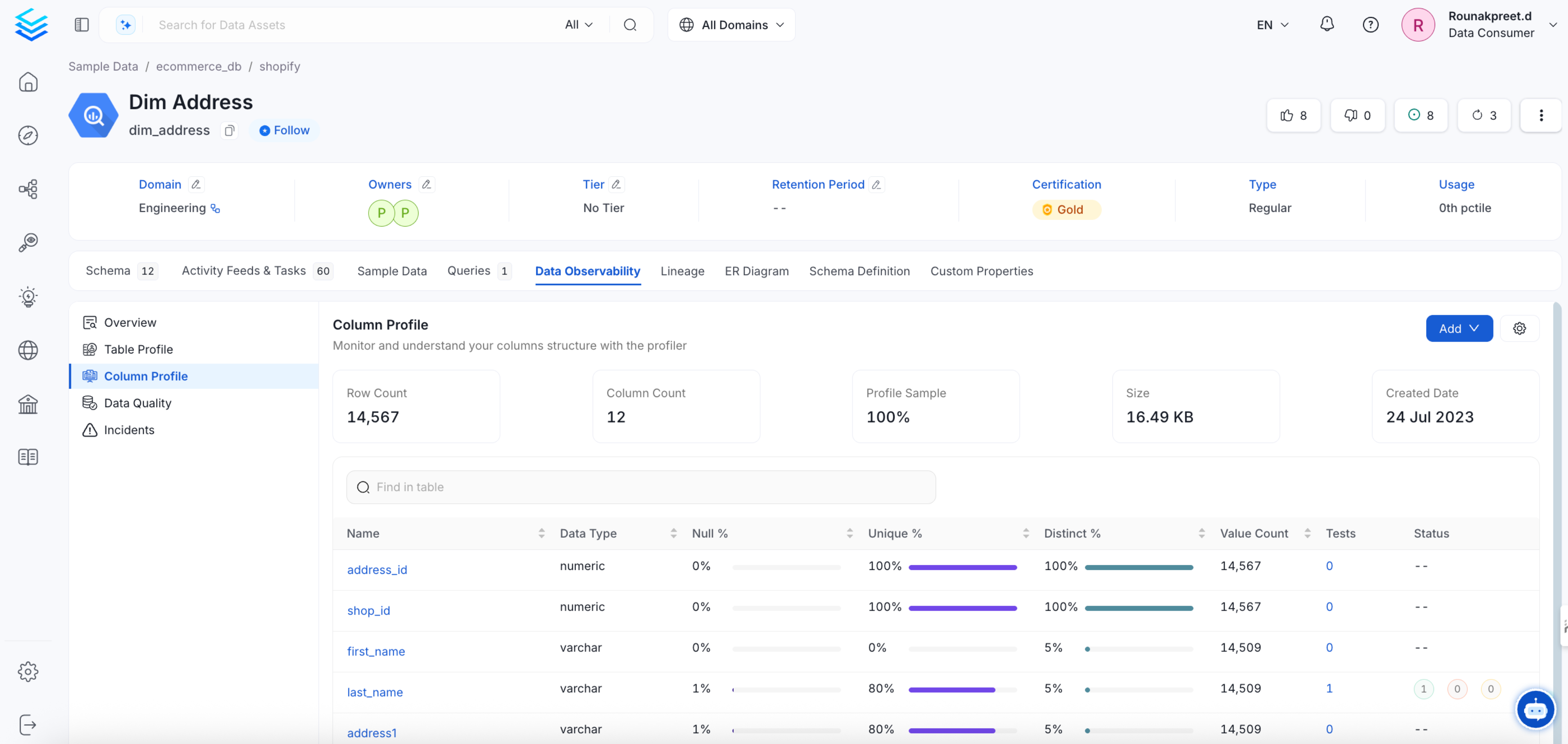
Data Counts
The data counts chart provides information on the Distinct Count, Null Count, Unique Count, and Values Count.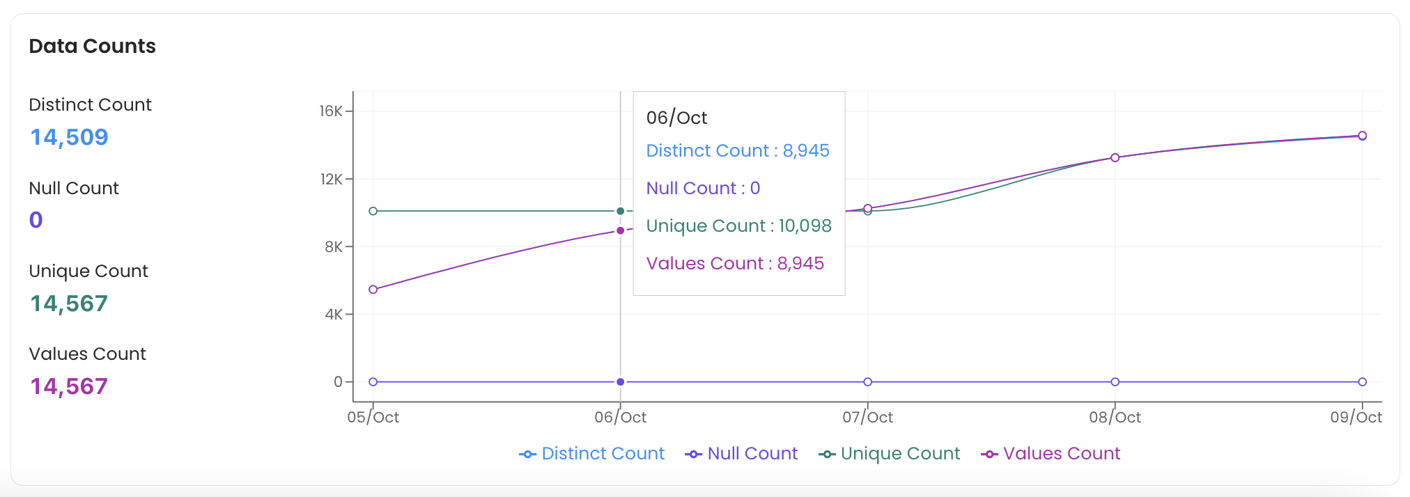
Data Proportions
The data proportions chart displays the Distinct, Null, and Unique Proportions.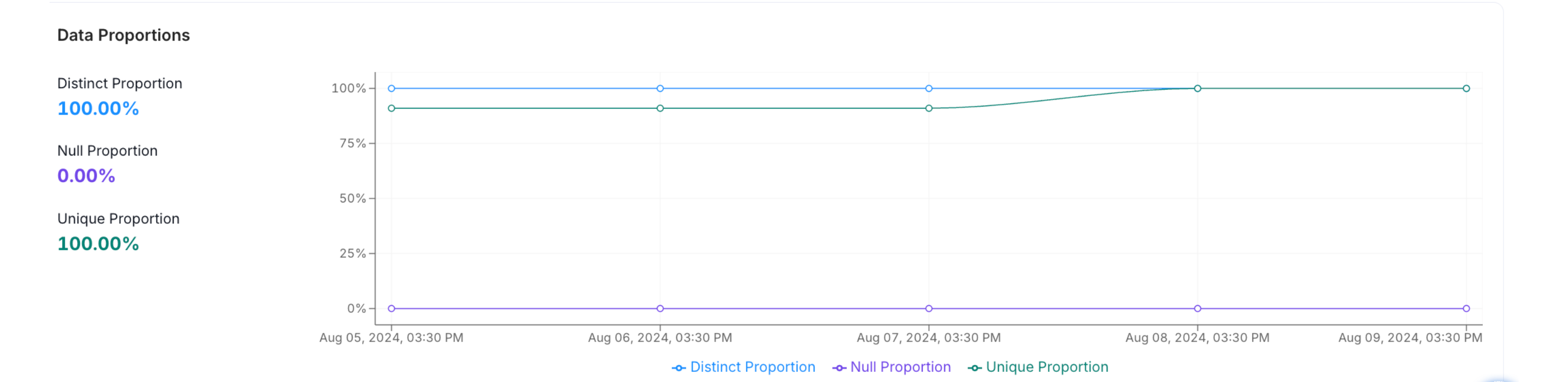
Data Range
The length of the string that are stored in the database is profiled. The data range displays the Minimum, Maximum, and Mean values, which can be helpful for users who are doing an NLP or Text analysis.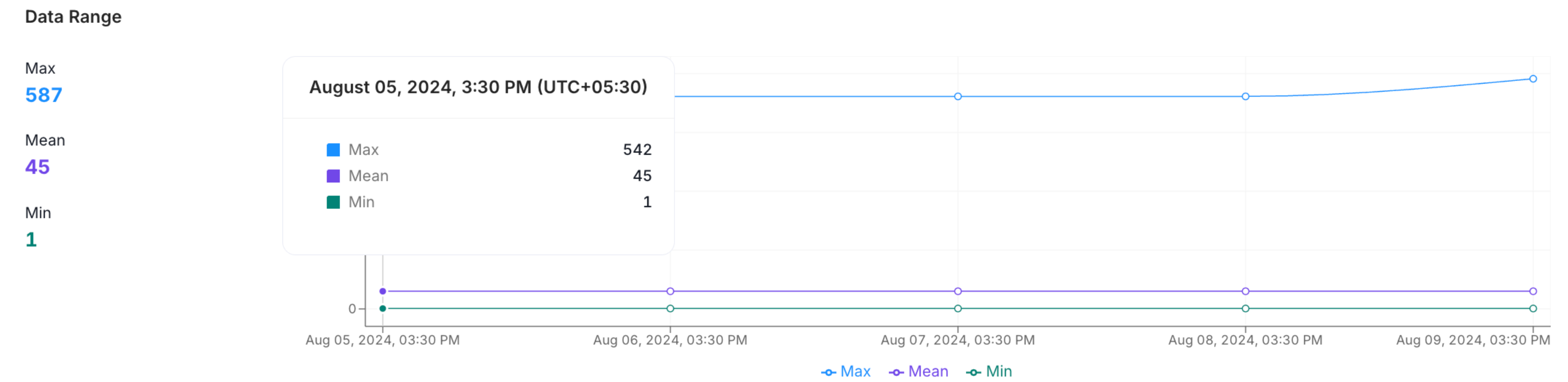
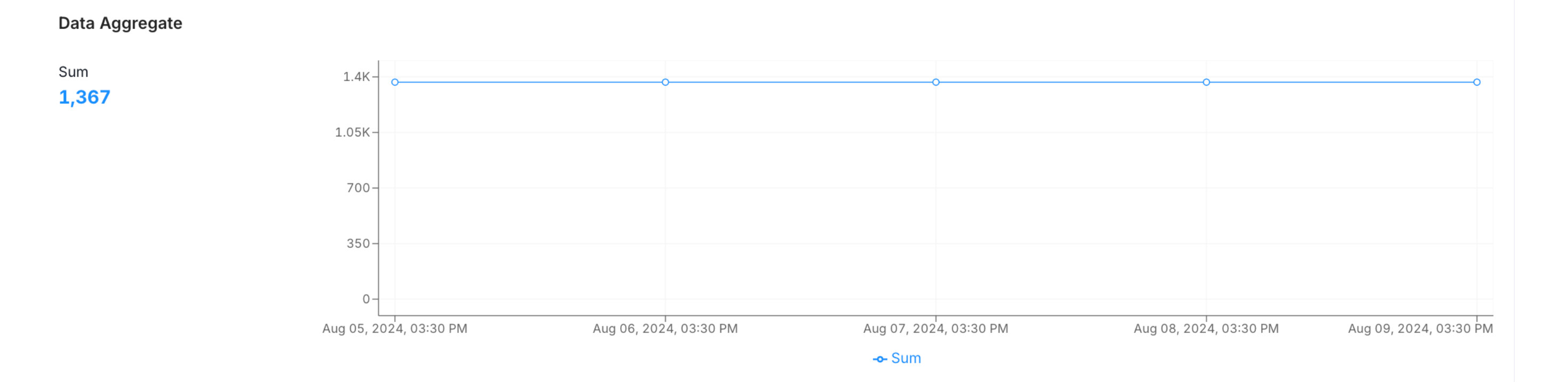
Data Aggregate
Data Quartiles
This chart displays the First Quartile, Median, Inter Quartile Range, and the Third Quartile.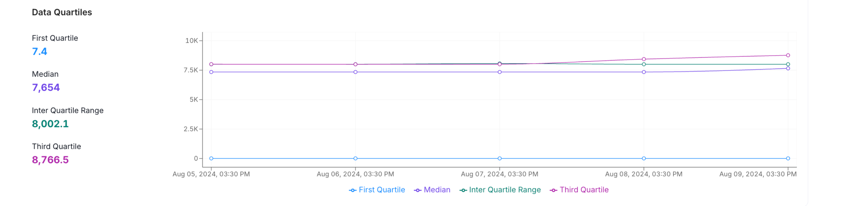
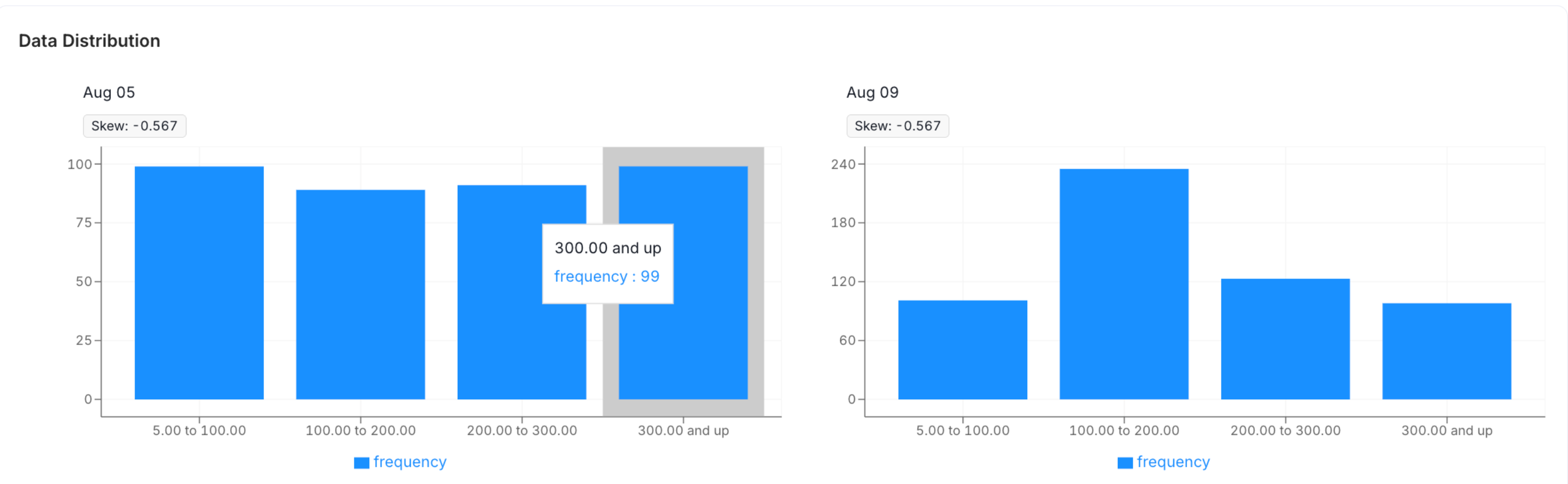
Data Distribution
The distribution of the character length inside the column is displayed to help you get a sense of the structure of your data.