
The 3D Knowledge Graph
Every table in OpenMetadata carries a Knowledge Graph tab that renders its neighborhood as an interactive 3D force-directed graph. It is the fastest way to see, rather than query, how one asset sits in the wider catalog.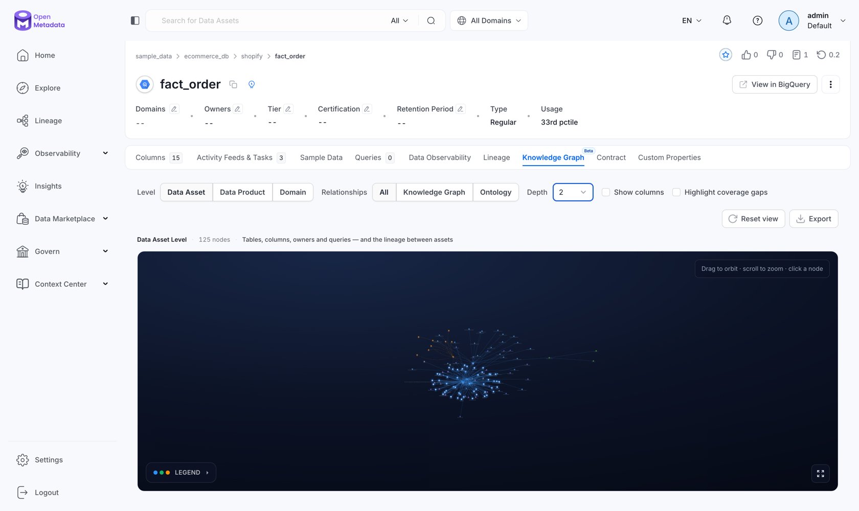
The tab is hidden unless RDF is enabled, and is marked Beta. It reads from
GET /api/v1/rdf/graph/explore, which is admin-only.Levels
The Level control changes what kind of thing the graph is about. It is not a filter — it is a different question.
Zooming out from asset to domain is the difference between “what feeds this table” and “which parts of the business are coupled, and through what.”
Relationships
The Relationships control changes which kind of edge is drawn:
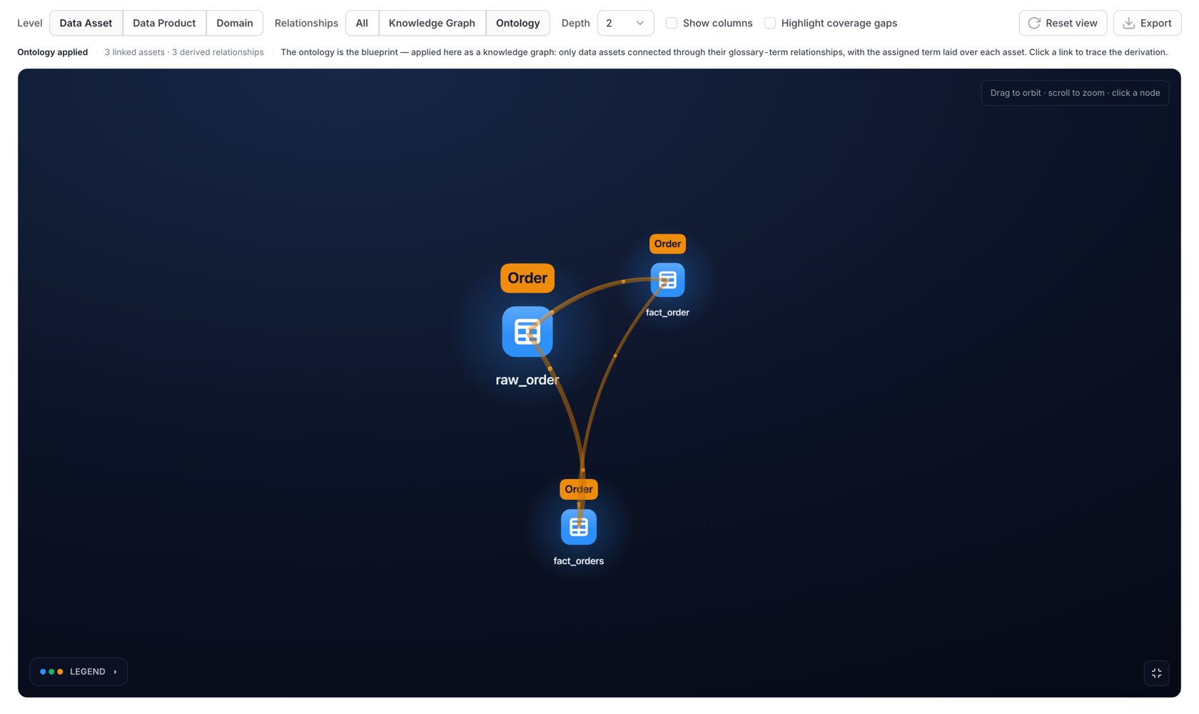
The Ontology option is the interesting one. It hides the plumbing and draws the business model as applied to real data: two tables appear connected not because a pipeline links them, but because the concepts they carry are related. Each node shows its primary glossary term (with a
+N badge when it carries more), and the caption summarizes N linked assets · M derived relationships.
Derived Relationships
Ontology-lens edges between two assets are derived — inferred by overlaying glossary terms, not read from a direct technical link. Selecting one explains exactly how it was derived:
The panel shows the full derivation chain as names — for example
savings_account → Savings Account → Accounts → Checking Account → checking_account — so a derived edge is never a black box.
Coverage Gaps
The Highlight coverage gaps toggle marks, in red, tables with no glossary-term mapping at all. This is the most actionable view in the product for a governance team. It answers “where is my ontology not applied?” visually, on real assets, instead of as a number on a dashboard. The gaps are where an AI agent will guess, because nothing has told it what that table means.Other Controls
Selecting a node opens a details panel with its type, description, mapped concepts, and neighbors — with Focus on node to re-center. Selecting a link opens an edge panel describing the relationship.
Reading the Picture
Node color encodes entity type and node size encodes importance at the current level; the primary type for the level is emphasized so the thing you asked about stands out. Technical links are drawn blue, ontology links amber, coverage gaps red. When the server had to bound the result, the caption says so explicitly — “Showing a partial graph — some relationships were omitted for performance.” A truncated graph is labeled rather than silently misleading.Troubleshooting
The tab is not there
The tab is not there
RDF is disabled on this server, or you are not looking at a table. The tab is registered for tables and hidden when
rdfEnabled is false.No knowledge graph data available
No knowledge graph data available
RDF is enabled but the graph has not been populated. Run the RDF Knowledge Graph Indexing application from Settings → Applications.
3D rendering is not available
3D rendering is not available
The browser does not support WebGL, or it is disabled. Check
chrome://gpu or the equivalent, and hardware-acceleration settings.The graph is dense and hard to read
The graph is dense and hard to read
Drop Depth to 1, switch Relationships to Knowledge Graph or Ontology to halve the edges, and turn off Show columns.
Exporting the Underlying Graph
The scene export produces a PNG. To take the data with you, use the export endpoint the tab reads from:format accepts turtle or jsonld. entityTypes and relationshipTypes accept comma-separated filters.
Next
Querying with SPARQL
When clicking is not enough.
Graph Insights
Importance, communities, and paths computed over the whole graph.